Novos Family
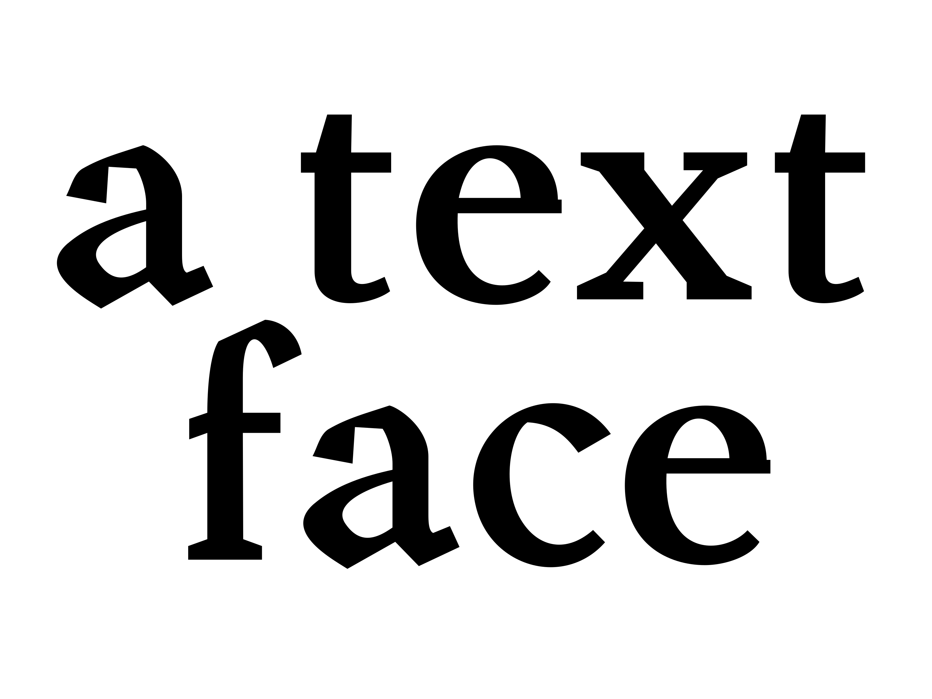
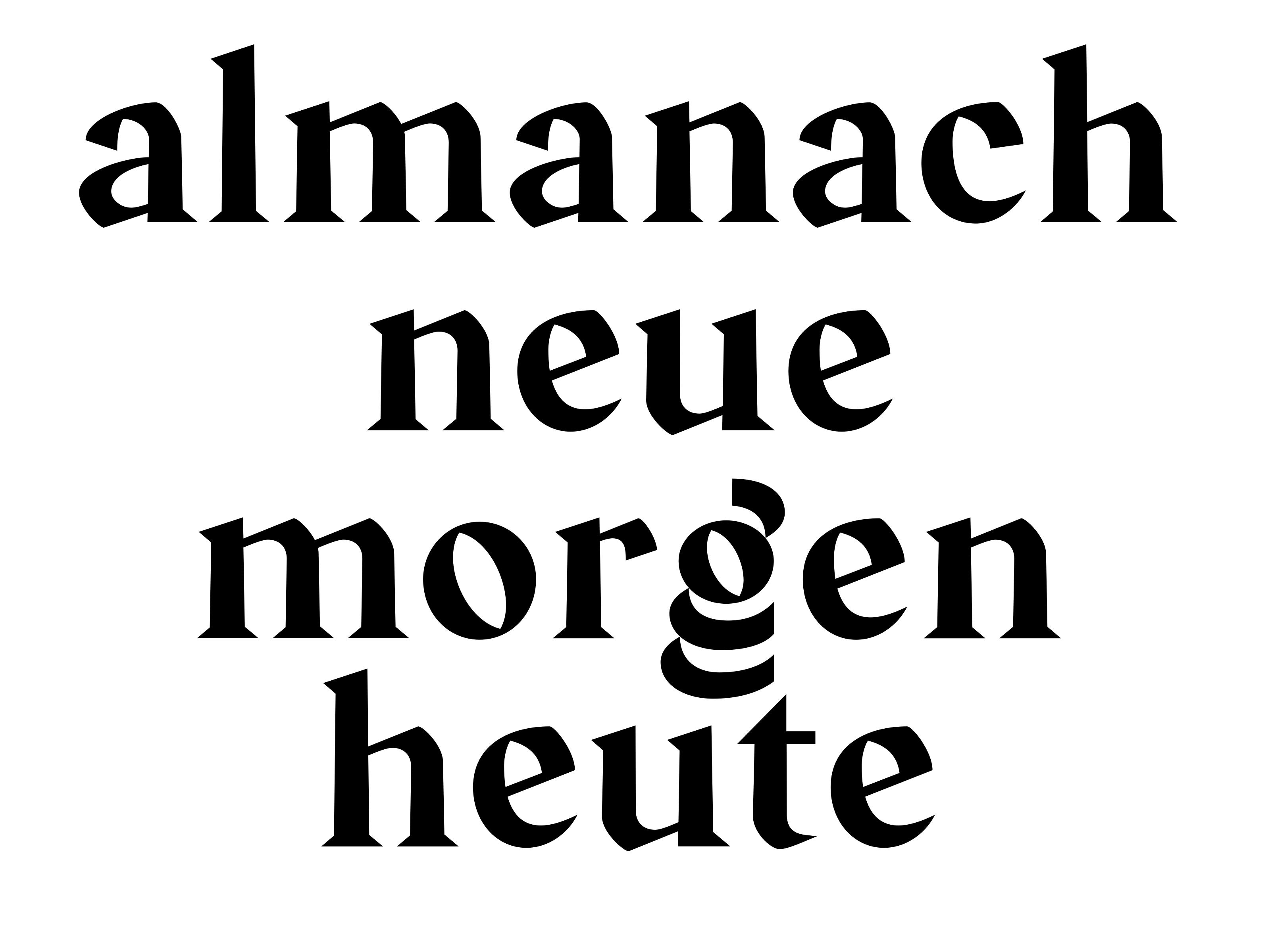
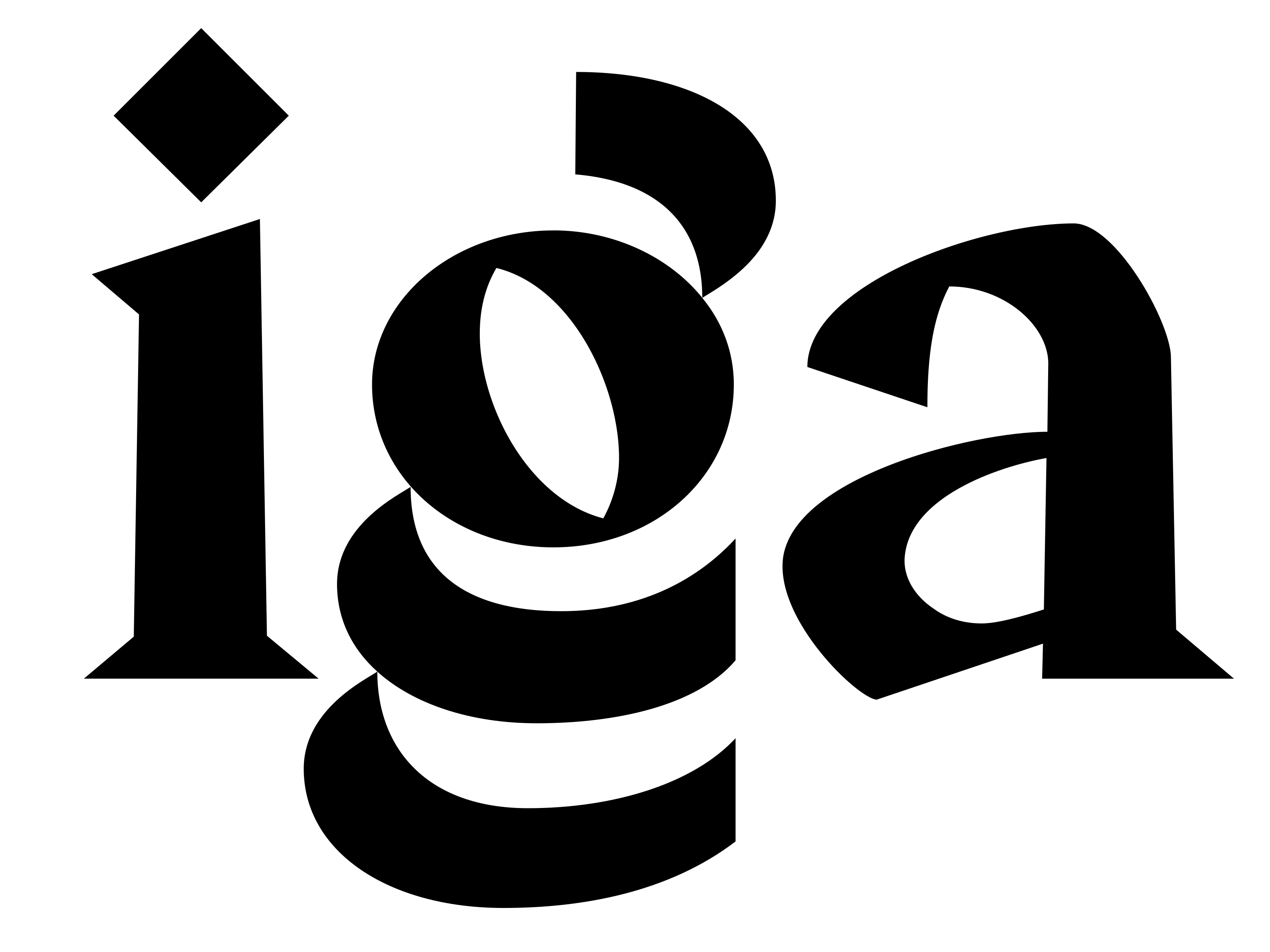
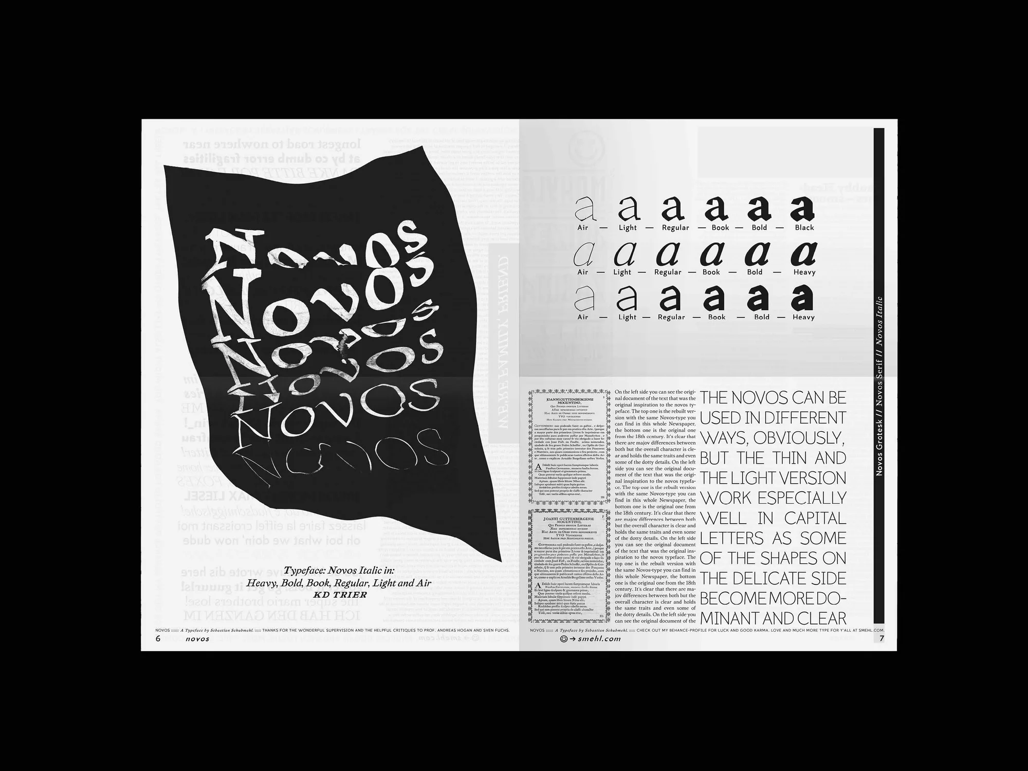
Novos emerged from an encounter with historical letterpress-printed original texts in the university library, including an 18th-century Italian book by Jao de Villeneuve as well as a work on Johannes Gutenberg's legacy. As an original typeface family, it was meant to pick up the roots of classical Roman antiqua and translate them into a contemporary form. The typeface adopts the low x-height of the original, giving it an almost classical appearance, but compensates for this with a stronger contrast between capitals and ascenders. The forms are deliberately kept coarse — echoing the coarse lead type of the source — lending the letters clear distinguishability. Thanks to their own wide tracking, the capitals almost read as an independent element. The regular cut is conceived as a compromise between historical character and contemporary legibility, and is ideal for long body text.
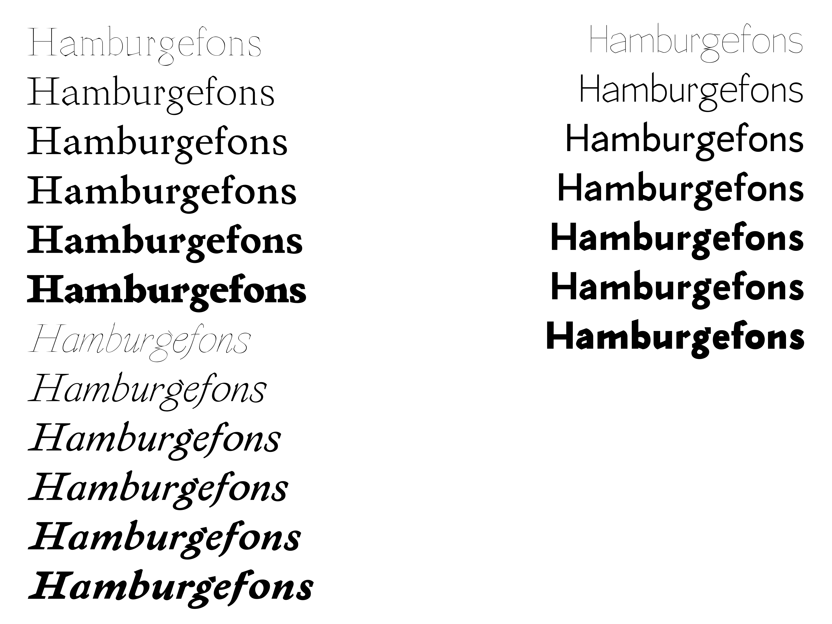
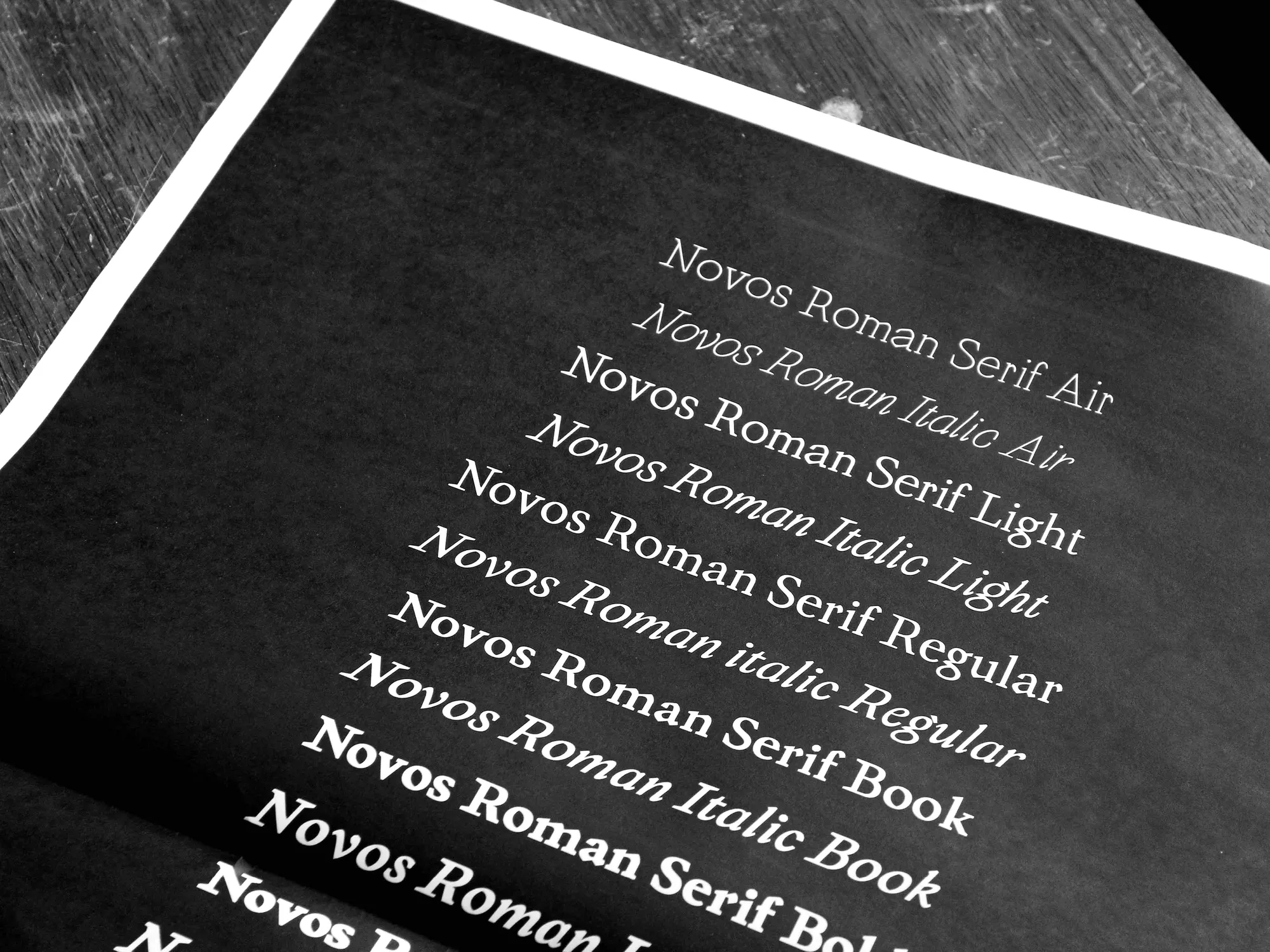
Serif + Italics und Sans Serif in Air, Thin, Light, Regular, Book, Bold, Black
