Werkschau Campus Gestaltung 2023
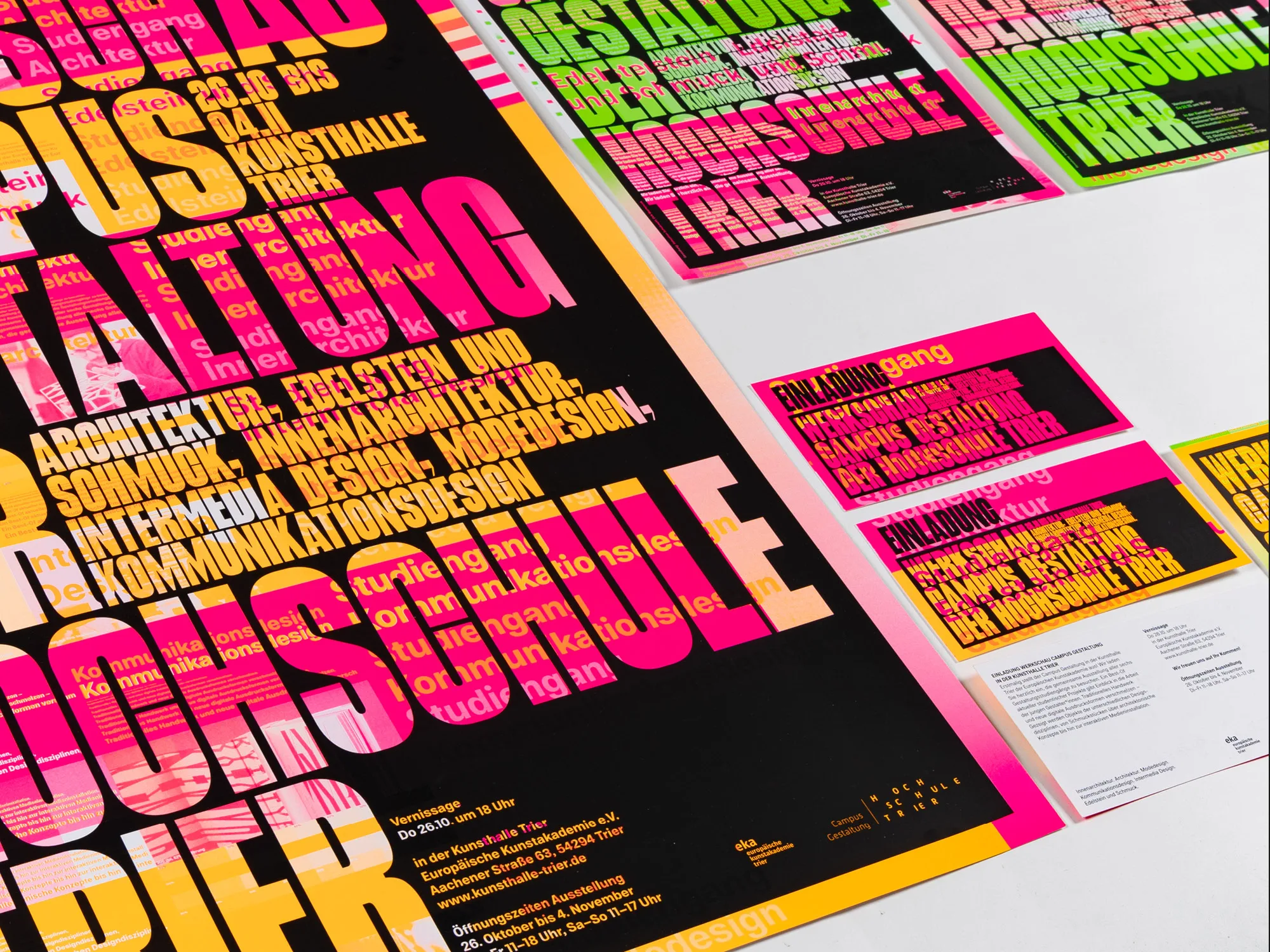
A typographic identity for Hochschule Trier's Werkschau. The visual identity for a best-of showcase of current student work plays with chance and with the visual codes of the individual degree programs.
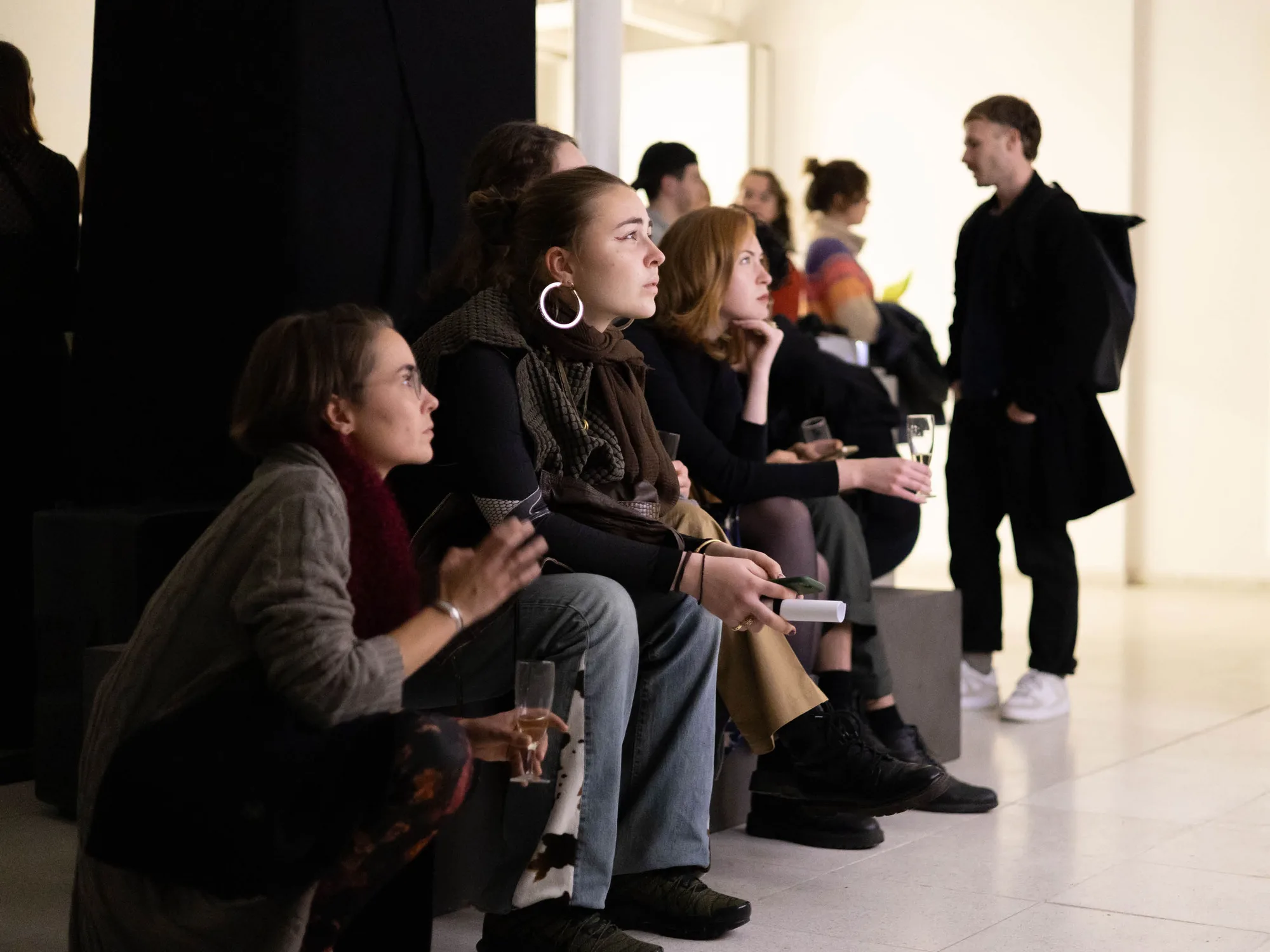
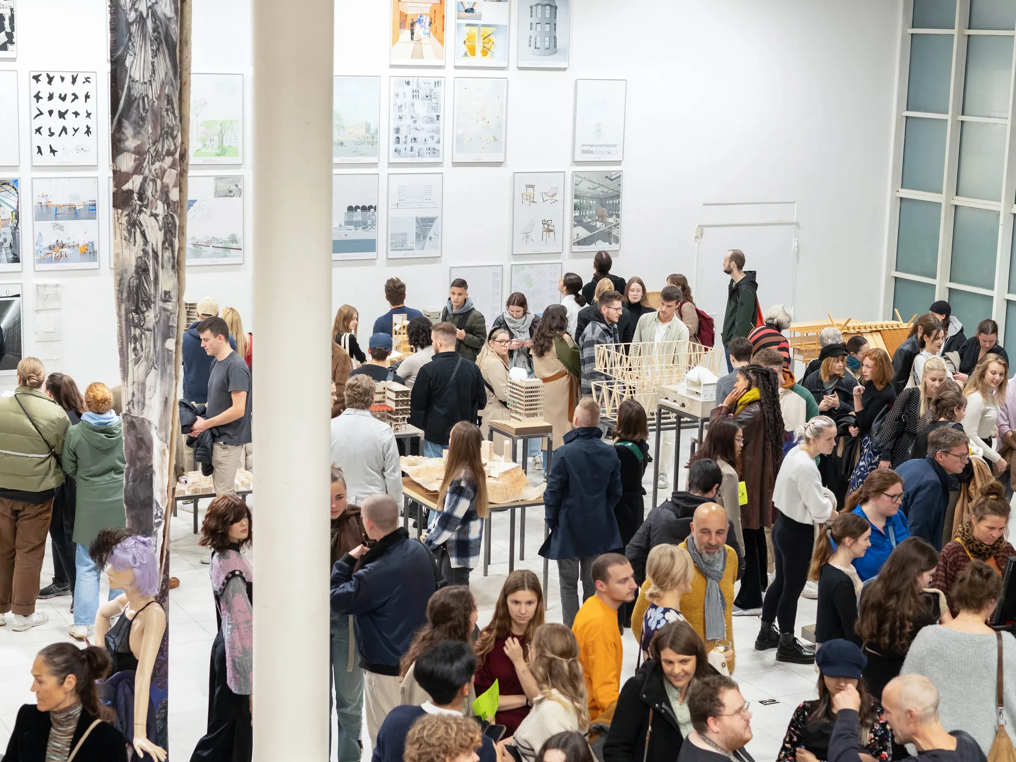
From October 26 to November 4, all six degree programs of Campus Gestaltung at Hochschule Trier exhibit at the Kunsthalle Trier of the European Academy of Fine Arts: Interior Architecture, Architecture, Fashion Design, Communication Design, Intermedia Design, and Gemstone and Jewelry.
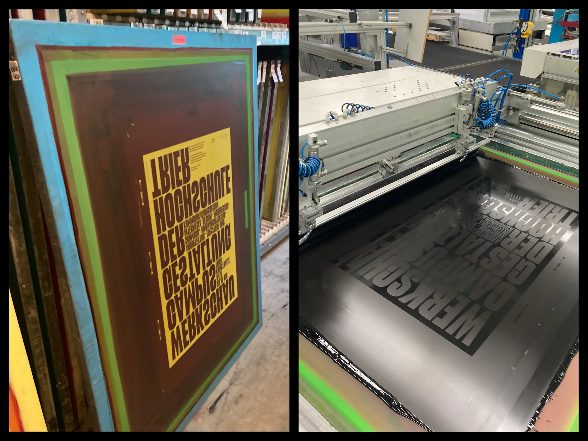
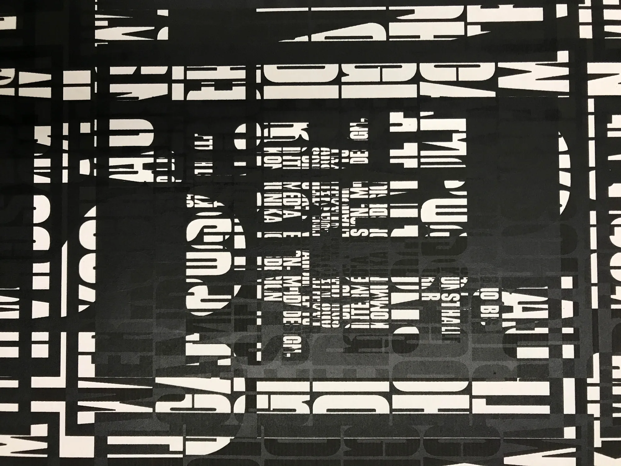
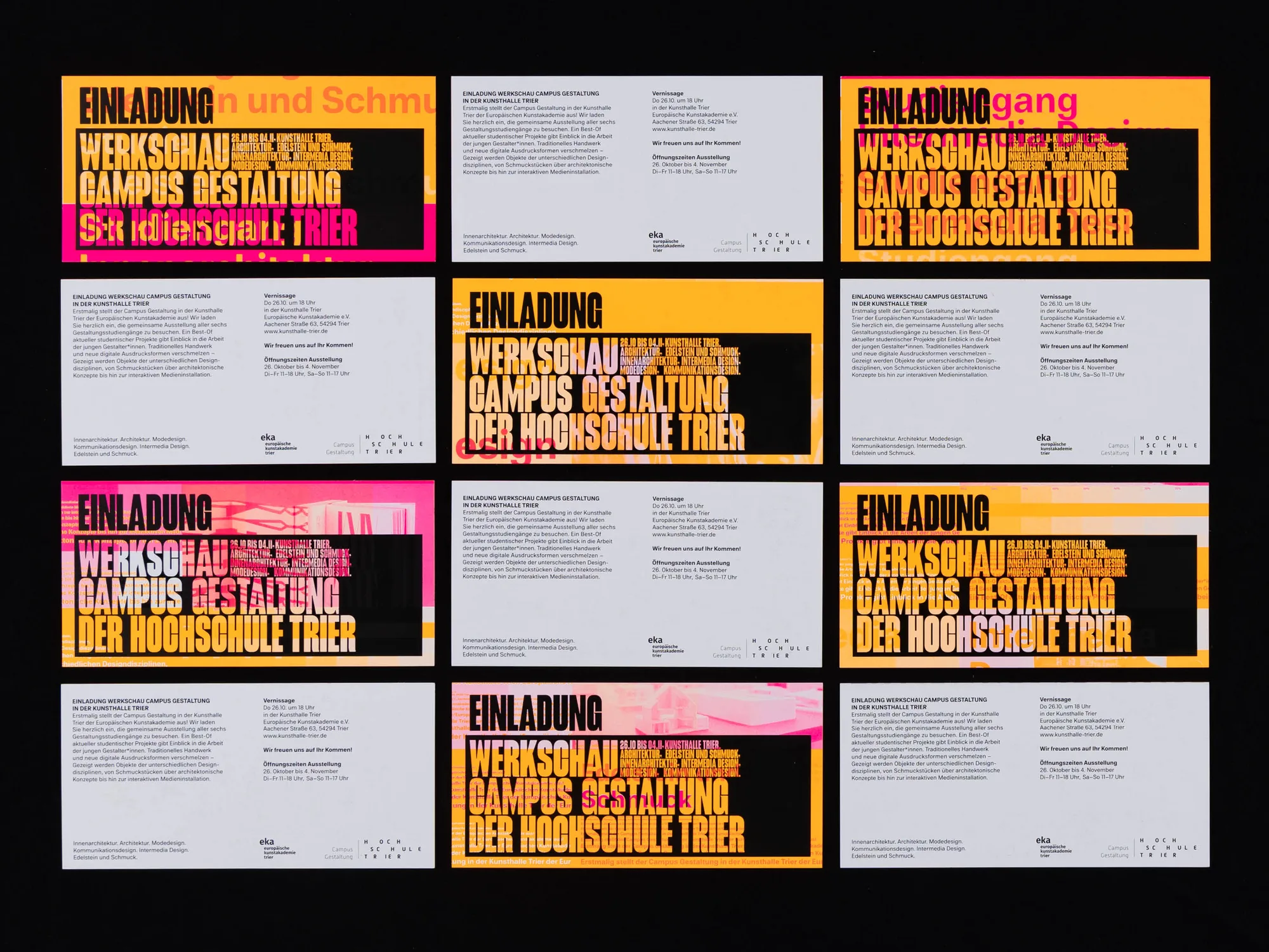
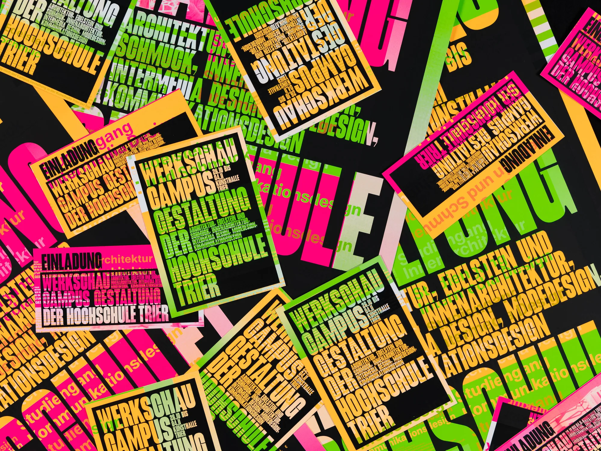
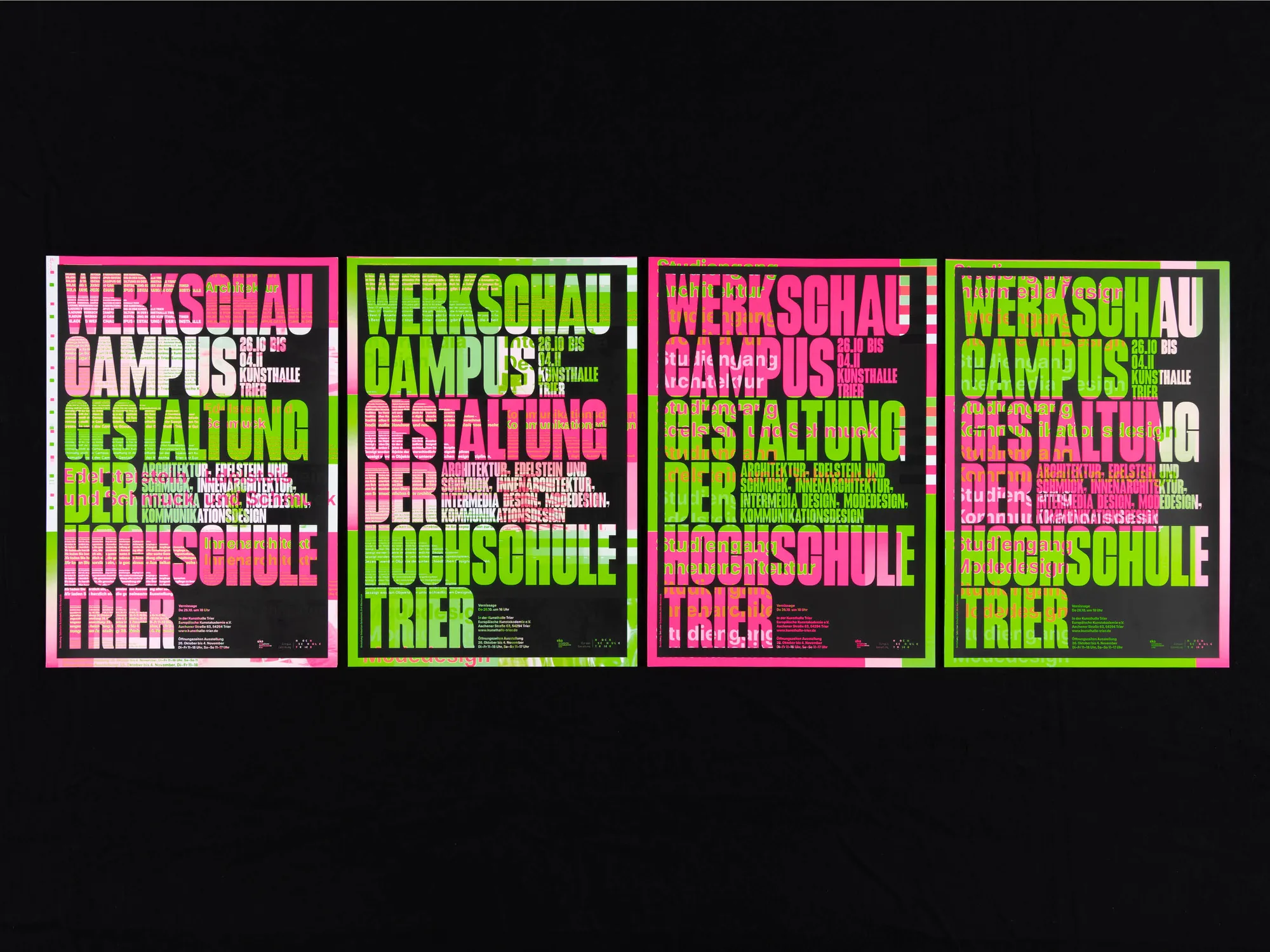
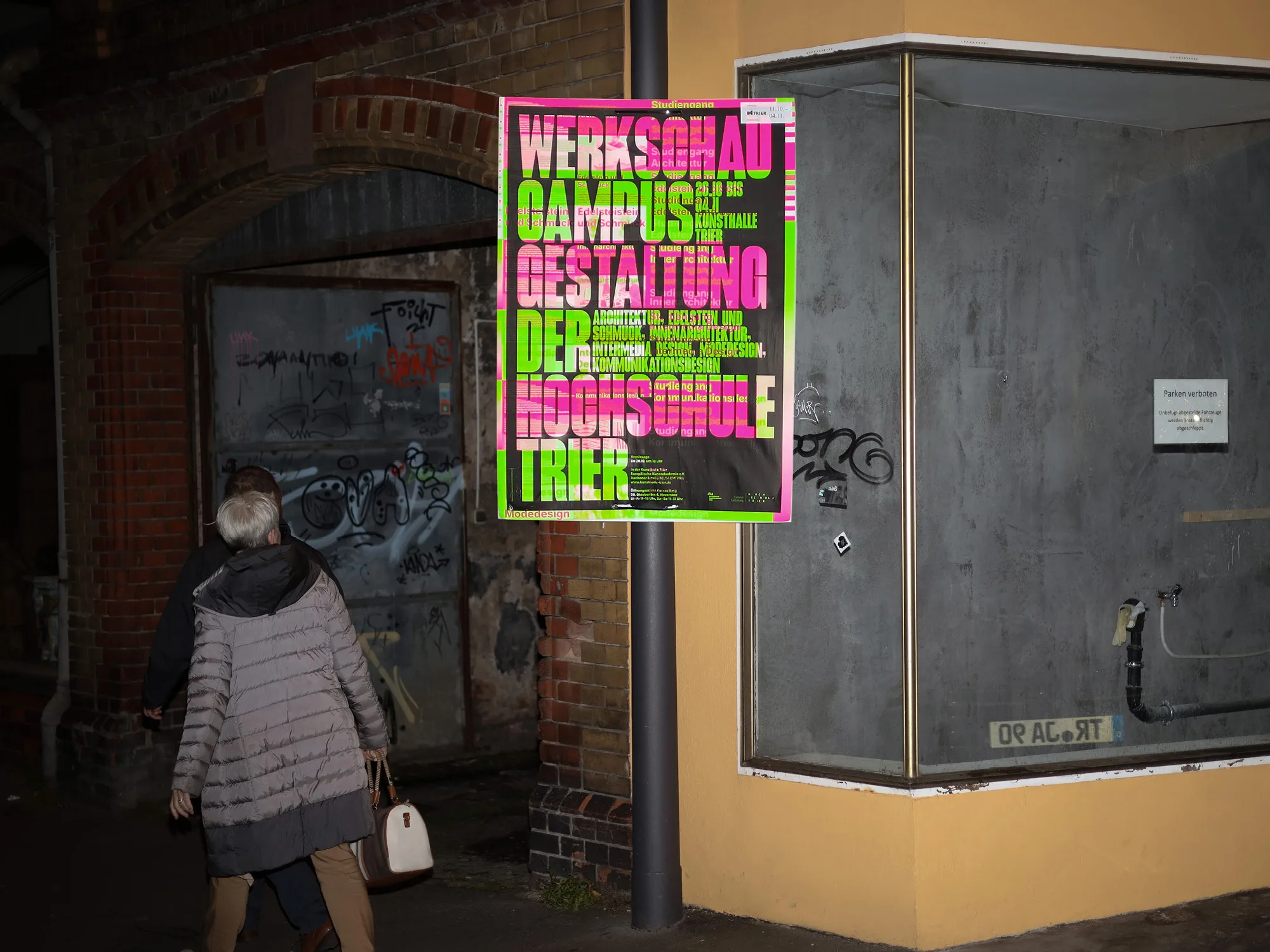
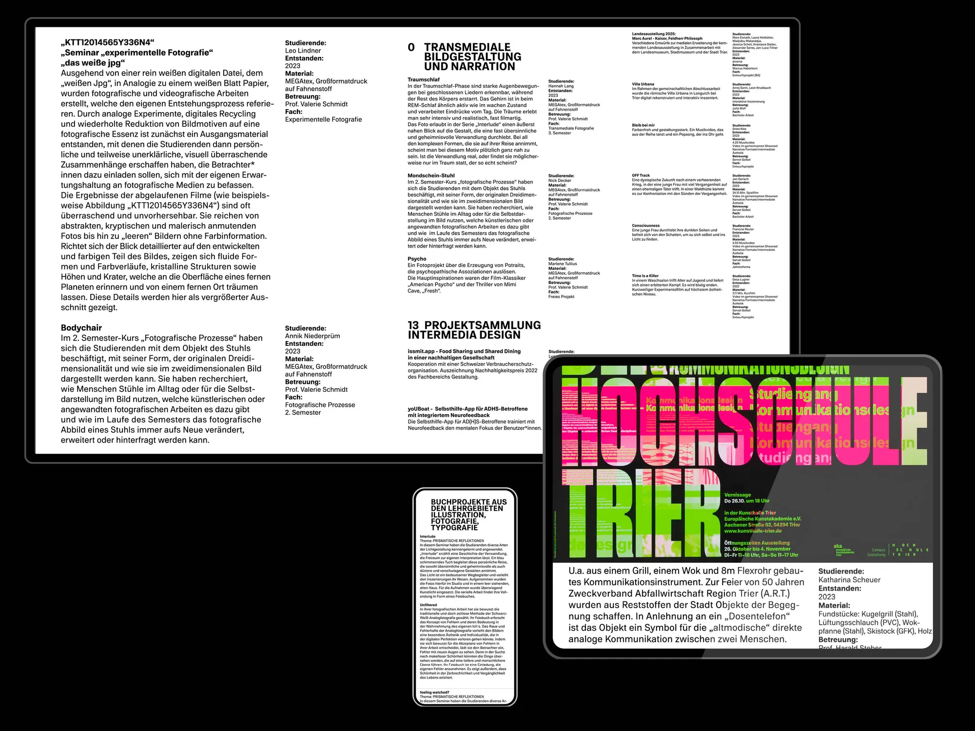
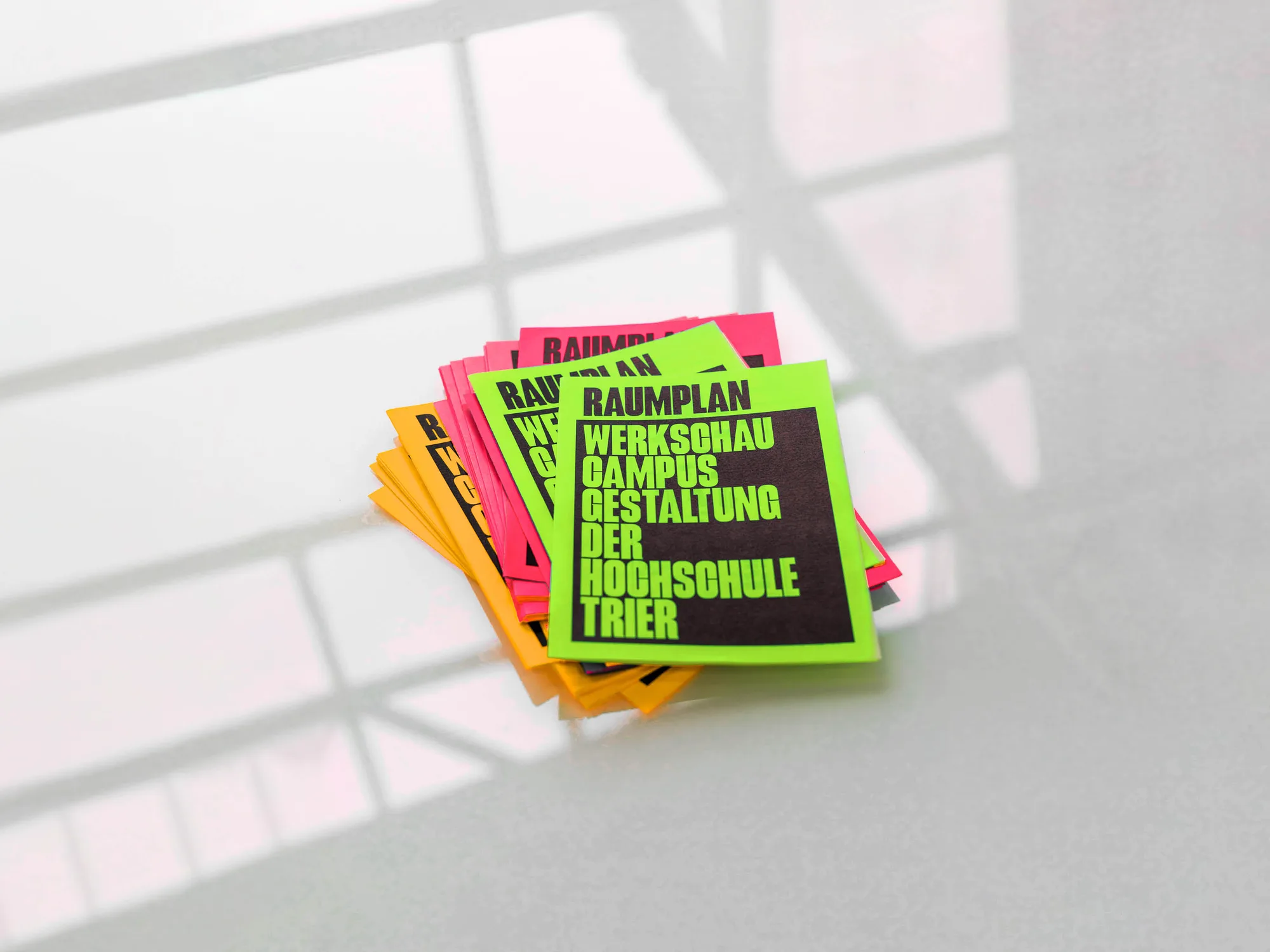
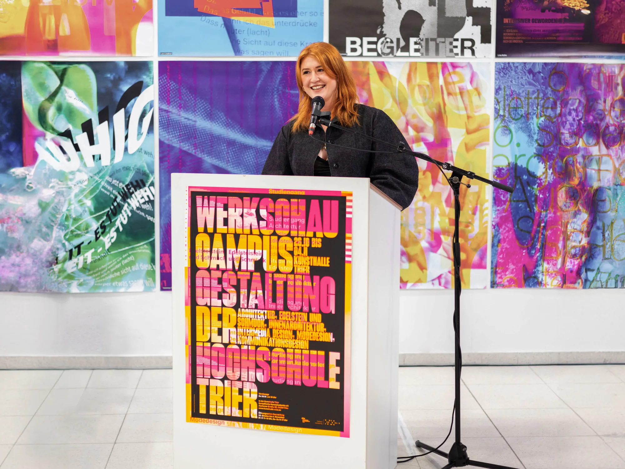
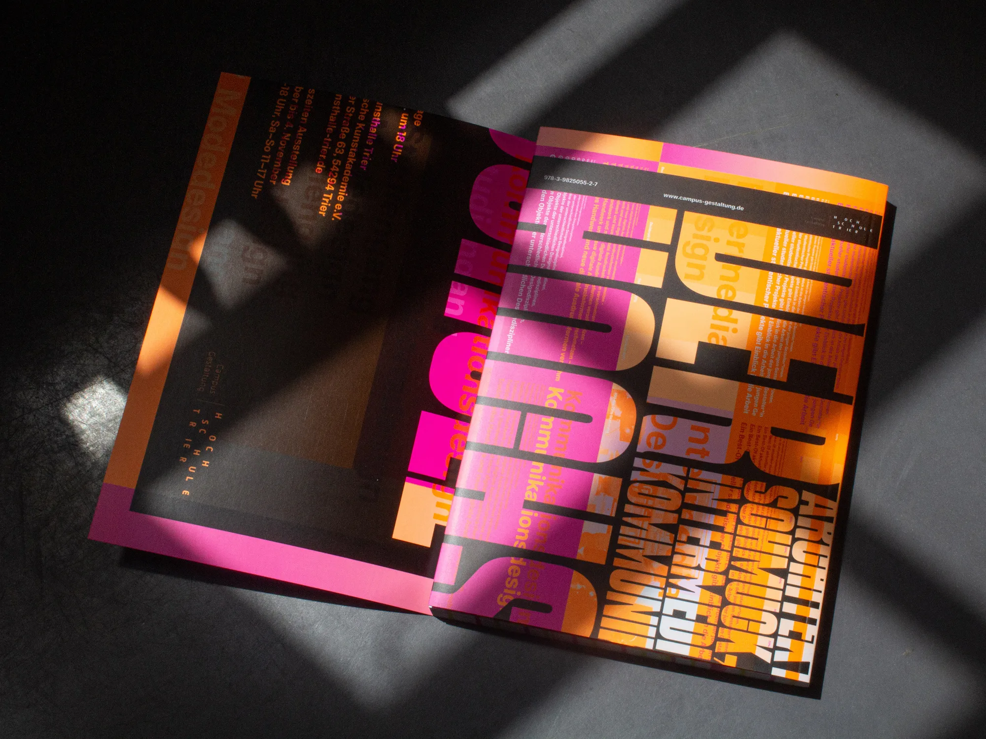
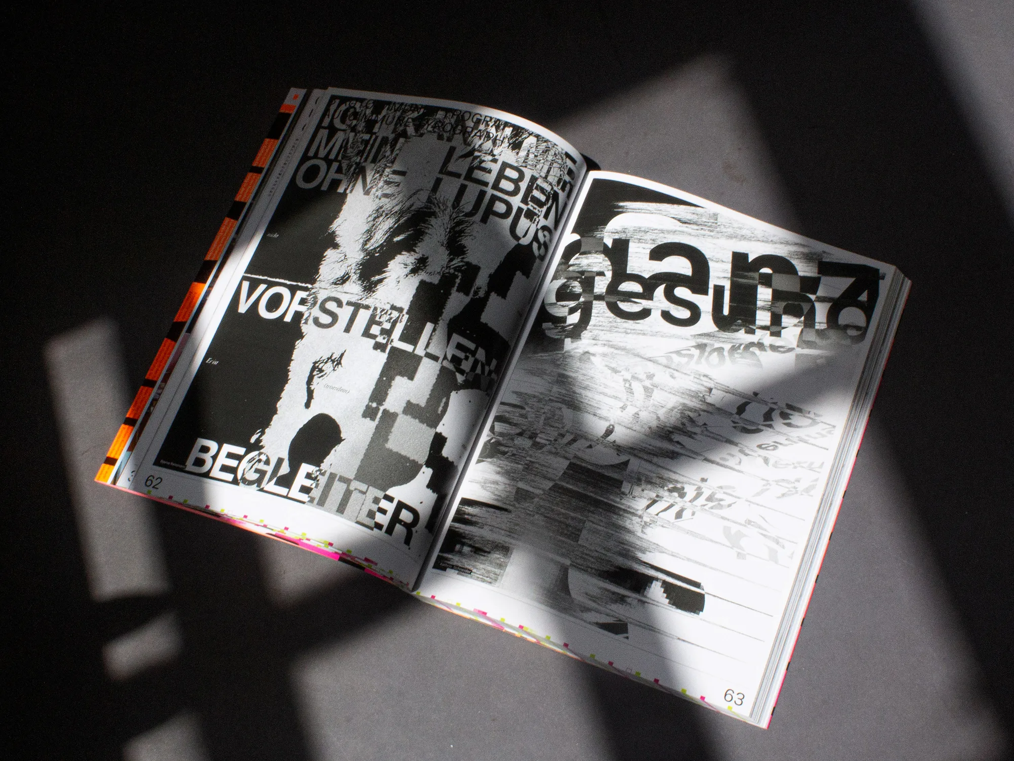
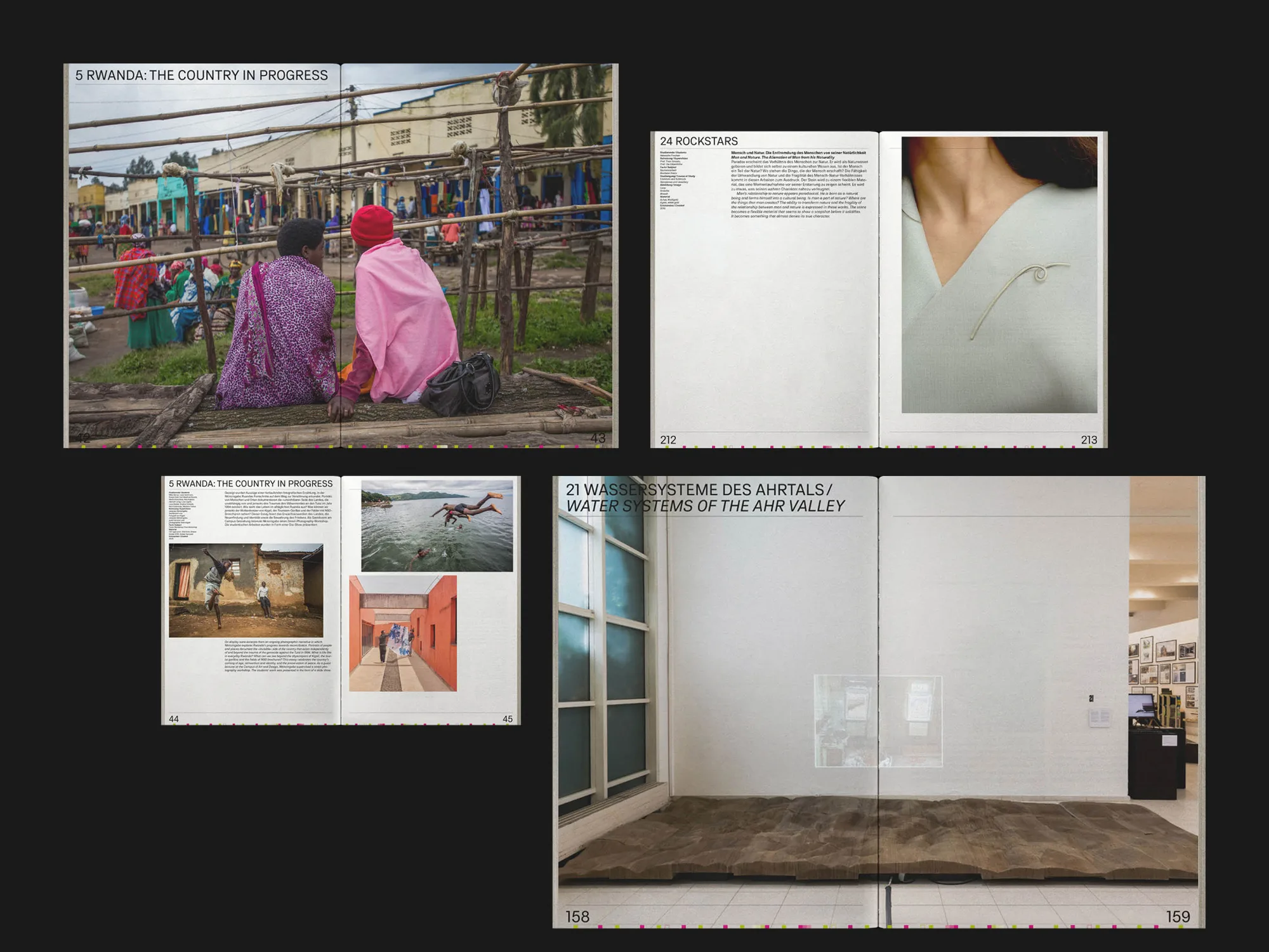
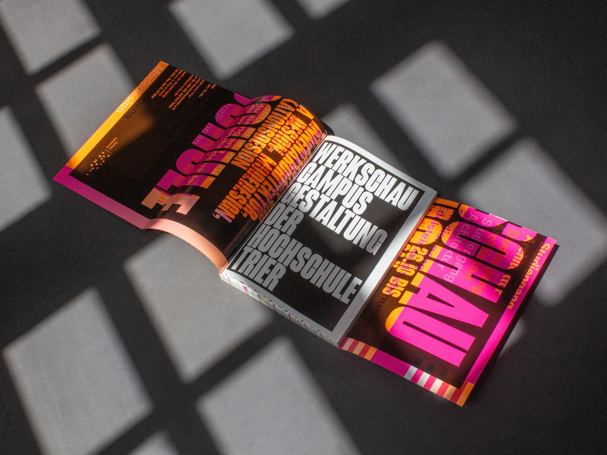
For this, a visual identity was developed that plays with visual codes important across all six degree programs: draft, process and analysis. A colored proof sheet was created, serving as the basis for all print media (A1/A2 posters, flyers, exhibition catalogue and invitations).
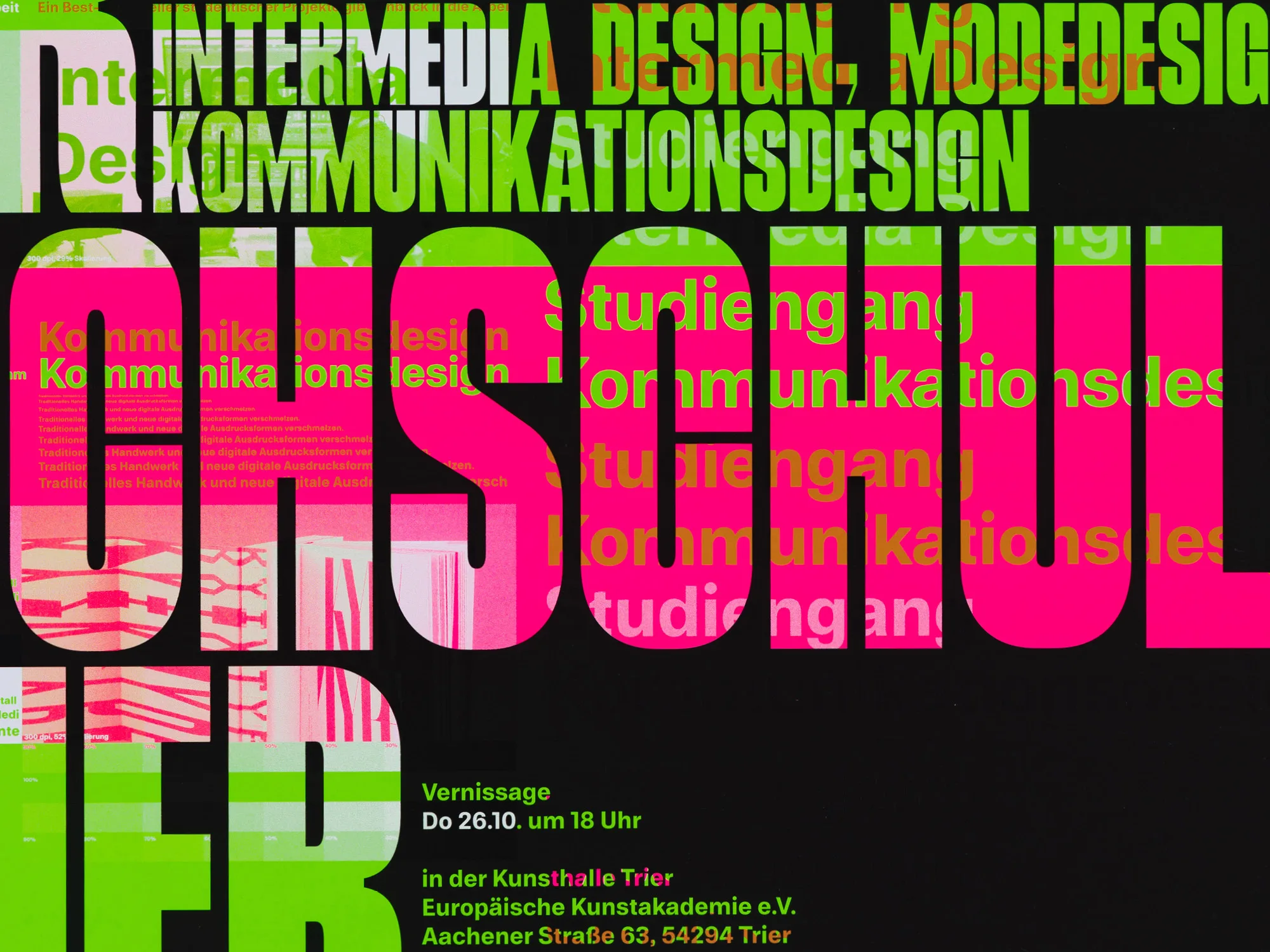
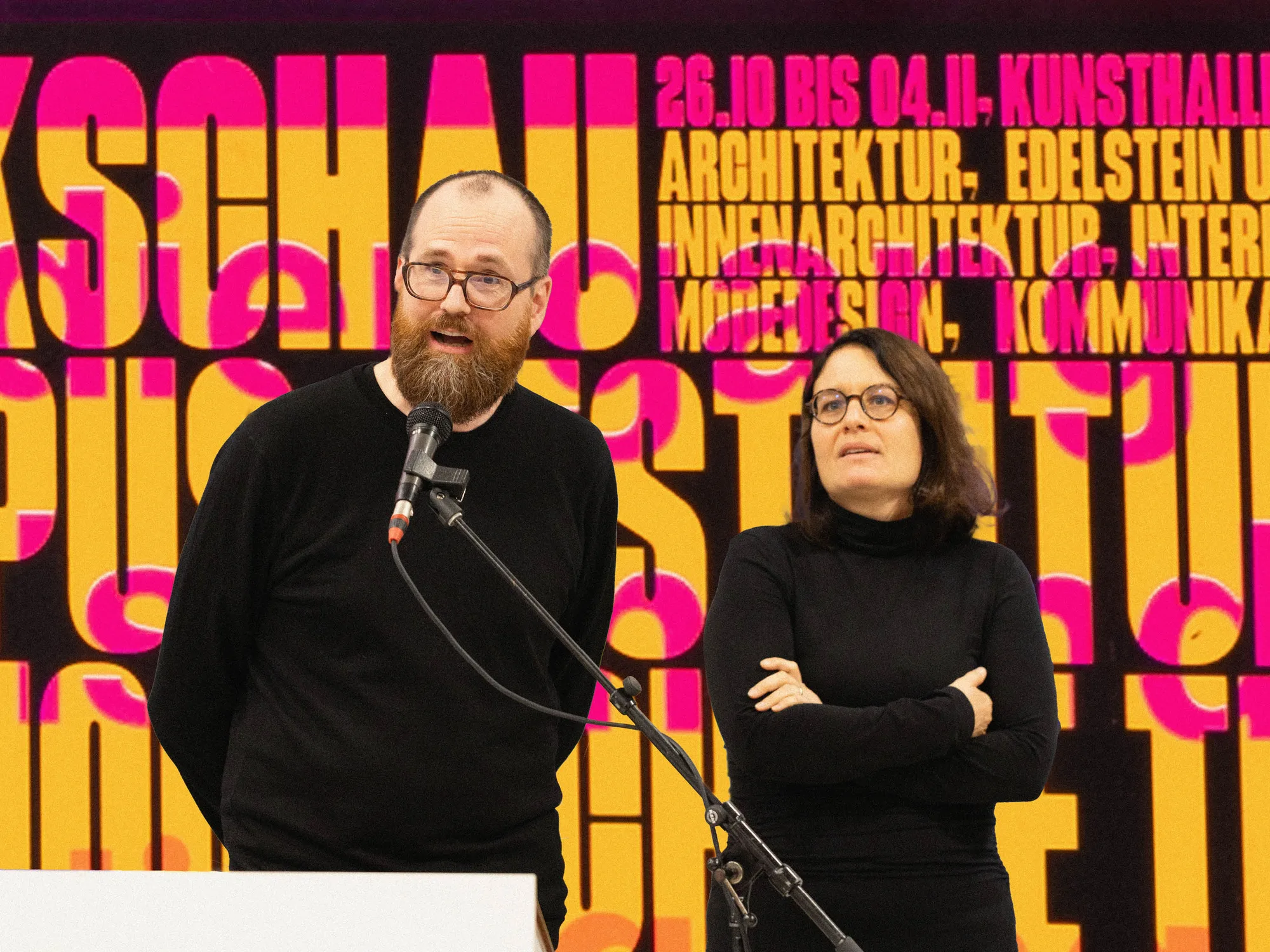
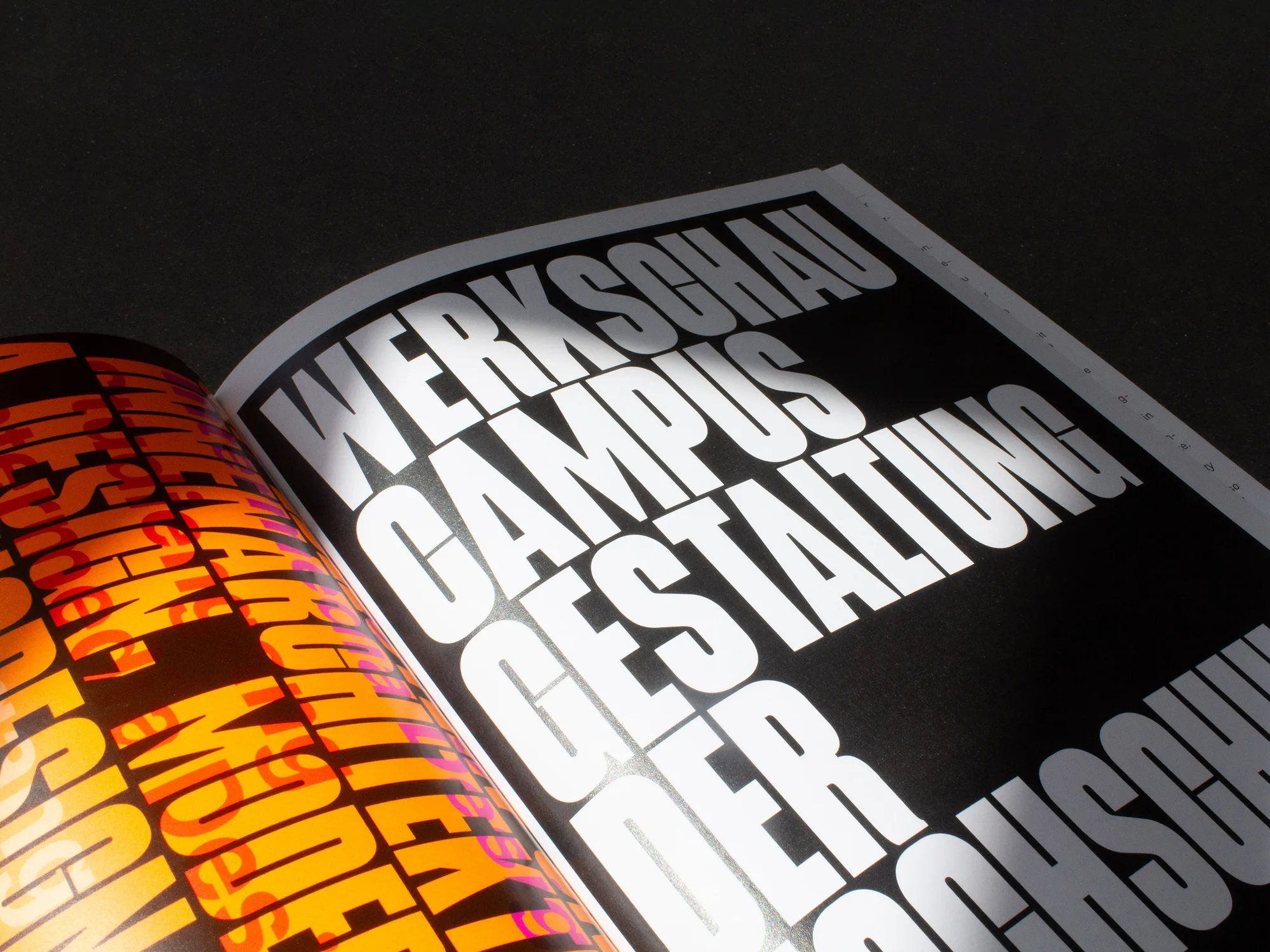
Chance and control were deliberately played off against each other by leaving the printer to decide the exact position of the black print marks on the colored proof sheet – which in turn affected the individual crops of the A3 posters, invitation cards, book cover and flyer. The final motifs could only be guessed at until delivery – possible registration flashes in the trim were deliberately accepted. Three neon colors, appearing in varying combinations, create a powerful and colorful visual presence. For the body text, the typeface Referenz Grotesk was used, published in 2020 by Stefanie Schwarz and Dirk Wachowiak through their studio open2type Typographic Research Lab with the type foundry Sudtipos. The second typeface – a striking display font – also comes from Dirk Wachowiak, but is still a work in progress and is currently being tested specifically for poster applications at the university. Features such as missing descenders, extremely narrow letterforms and bold stroke weights ensure that even longer words or texts can fit on posters.
